
Feedly is a B2B Saas Threat Intelligence platform that leverages AI to keep cybersecurity analysts on top of emerging threats.
1 Product Designer
1 Product Manager
1 Frontend Engineer
Market Qualified Leads (MQLs) are steadily increasing, but are not converting to Sales Qualified Leads (SQLs). Meaning, while many high-quality users are signing up for the free trial, they are not booking meetings with sales.
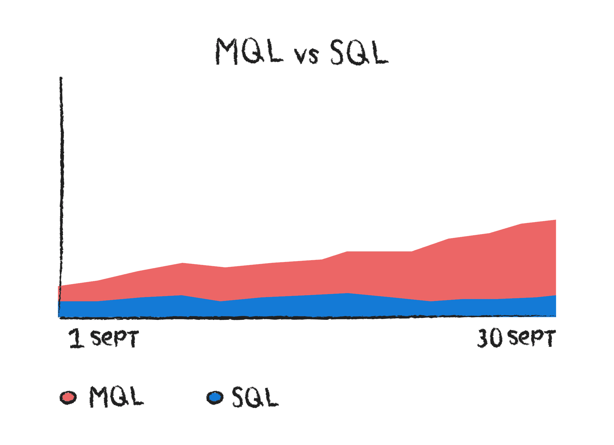
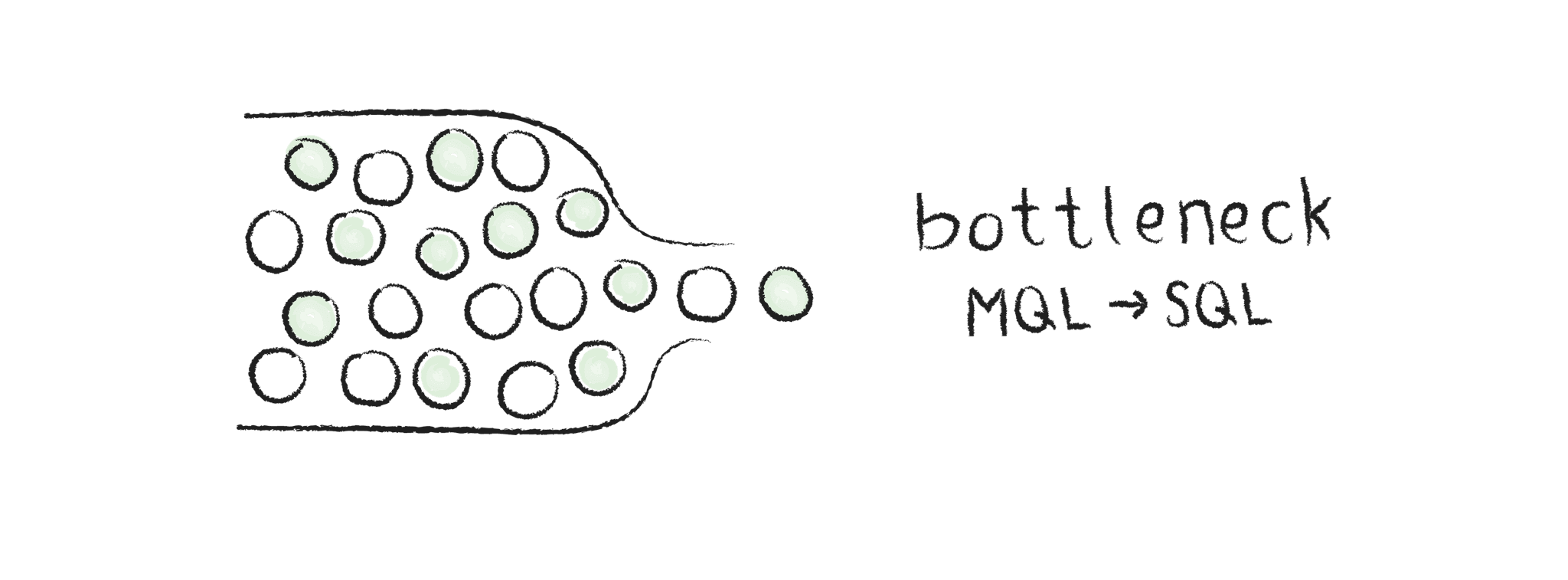
Low conversions from MQL to SQL is a bottleneck, directly impacting revenue growth. Of the users who talk to sales, most convert to paying customers.
Wasted acquisition spend as high-quality leads did not convert.
Lower perceived value of Feedly’s product due to a lack of guided onboarding.
Hotjar & Mixpanel: Users bounced around multiple sections quickly, indicating information overload.
User Interviews: Validated that trial users did not know how to start using the product.
Performance Analytics: The Get Started page was the second-most visited page after the landing page but had a high bounce rate.
Users have a 7-day free trial, but most users only have one session.
Hotjar session recordings show that users clicked through multiple pages/features without spending enough time to grasp their value.
User research studies show first-time users felt overwhelmed by information and did not know where/how to start.


Make Feedly’s 3 key AHA moments more discoverable to new users in their first session.
Reduce cognitive overload by simplifying the first-session experience.
Make onboarding more actionable by introducing clear entry points to key workflows.
Interactive walkthrough/Product Tour
Pros: Ability to clearly highlight all 3 core features and show users how to navigate the product.
Cons: Technical users prefer to be in control, Easy to skip.
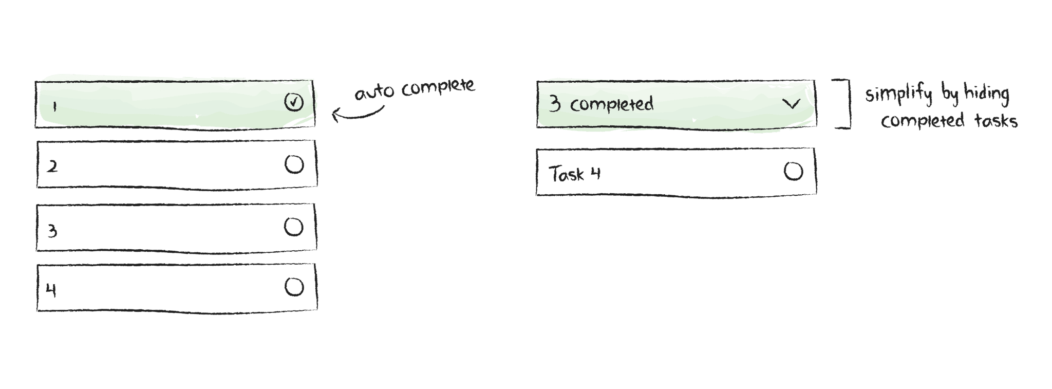
Get Started Page Redesign
Pros: Ability to include entry points to all 3 core features in one place, Users can open the Get Start page on their terms (most users prefer to play with the product a bit before reading instructions).
Cons: Users don’t like to read (can be solved be showing the value prop instead of telling).
Tooltips
Pros: Ability to point out where the 3 core features are
Cons: Annoying, Easily dismissible.
Focus on areas where users naturally seek guidance.
Prioritize solutions that require low engineering effort but can have high impact on activation.
Therefore, the solution we decided to test was a redesign of the Get Started page.
If we provide entry points to the 3 core features on the Get Started page, then user activations will increase.
Increasing user activations aligns with our product and company goals of increasing SQL conversion.
70% of trial users should discover all 3 core features (Insights Cards, AI Feed, and AI Actions) during their first session.
Baseline: Less than 10% of trial users (MQL) engage with the 3 core features.
Secondary metrics: Time spent on each feature, Number of bounces between pages/features.
Results
Early data shows 25% increase in user activations (users engaging with 1 or more of the core features) within the first session.
Reduced “bouncing” behavior—users spent more time engaging with features rather than clicking through the navigation.
Although this experiment did not hit it's goal of 70% of trial users engaging with all 3 core features during their first session, it did show a substantial increase in users experiencing at least 1 of the core features.
Therefore, my next steps are to:
Conduct qualitative research to better understand user behavior and thoughts on the new Get Started page.
Review Hotjar session recordings to understand why users are dropping off before experiencing all 3 core features.


There is limited growth in retail because breastfeeding parents traveling for work is not a regularly repeating activity.
1 Product Designer
1 Product Manager
MilkStork Stakeholders
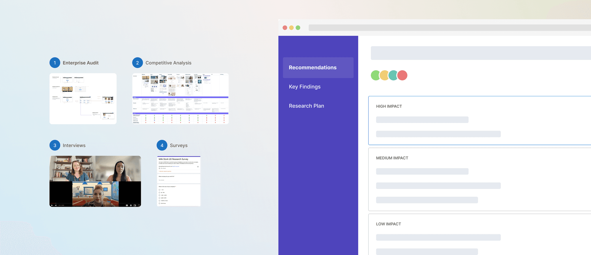
Identify and prioritize opportunities in MilkStork's enterprise experience through qualitative, quantitative, and generative research methods:
Stakeholder interviews
Enterprise Audit
Competitive Analysis
User Interviews (3-5 per user segment)
User Surveys (sent to all in each user segment, excluding sensitive potential benefits managers)
For the full case study, please contact me.


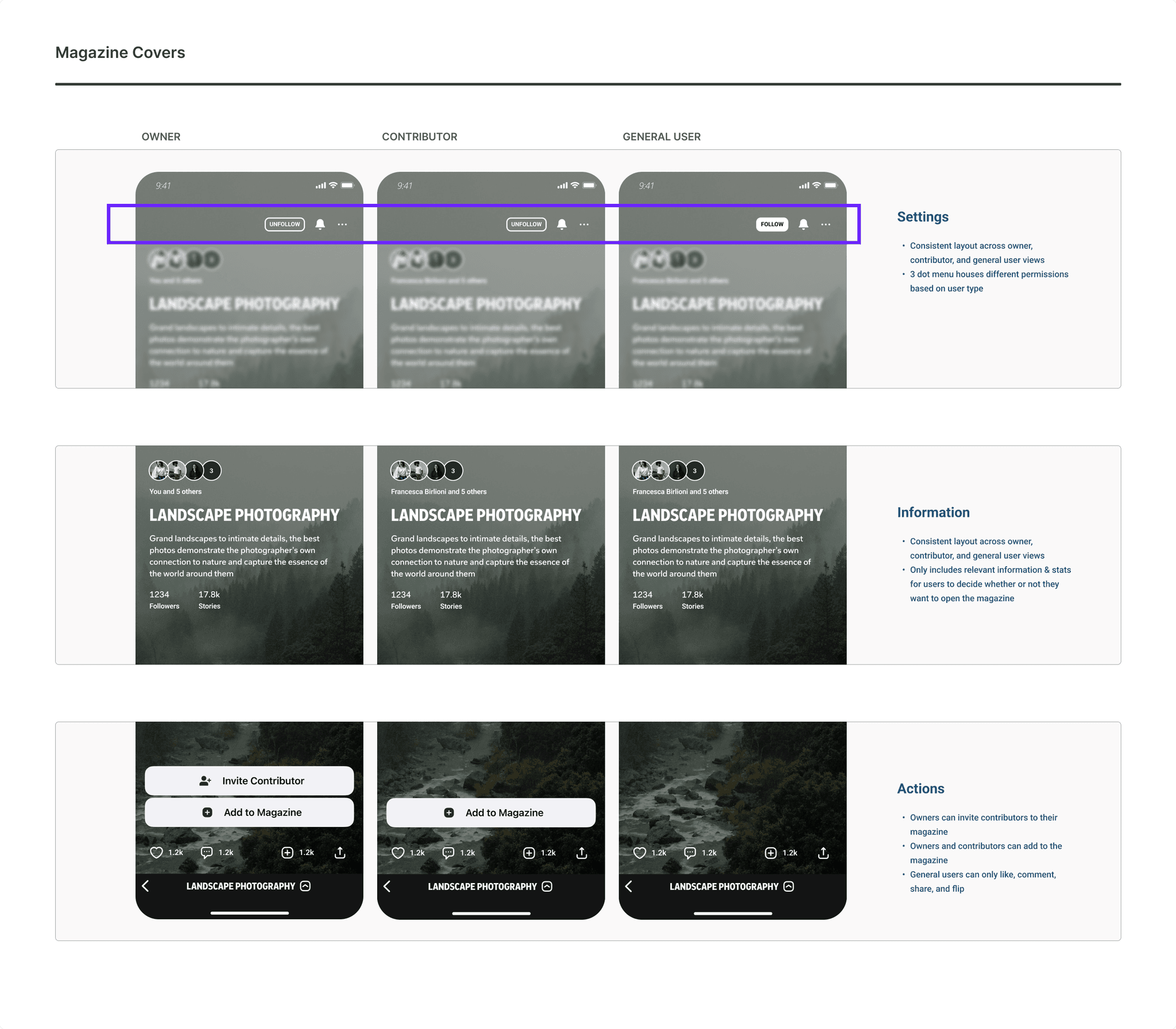
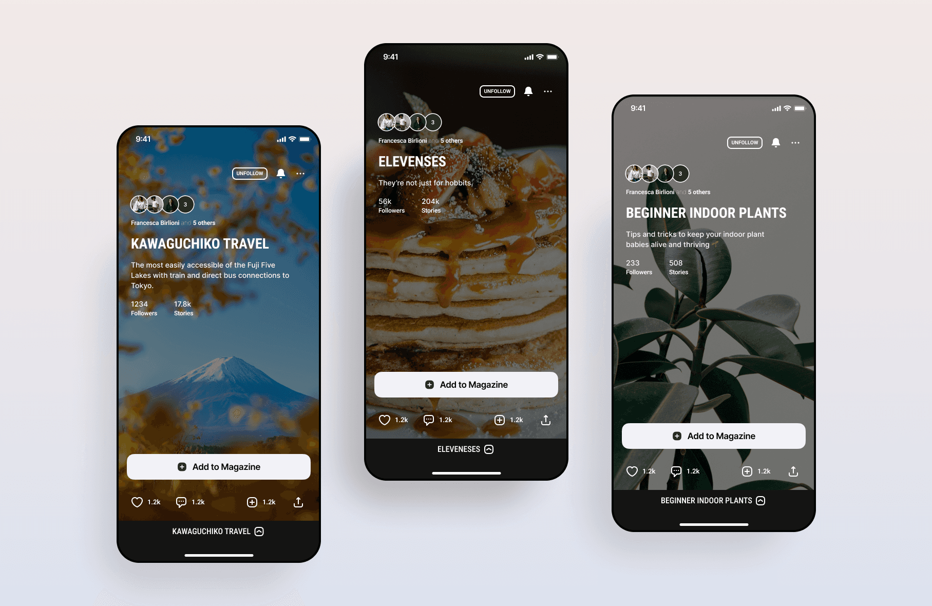
Users aren’t engaging with the micro-communities in magazines.
1 Product Designer
1 Product Manager
3 Engineers (iOS, Android, Web)
We decided to focus on increasing contributions to magazines because it means users are investing more time and energy into the platform and are therefore more likely to form habits around their Flipboard usage.
For the full case study, please contact me.
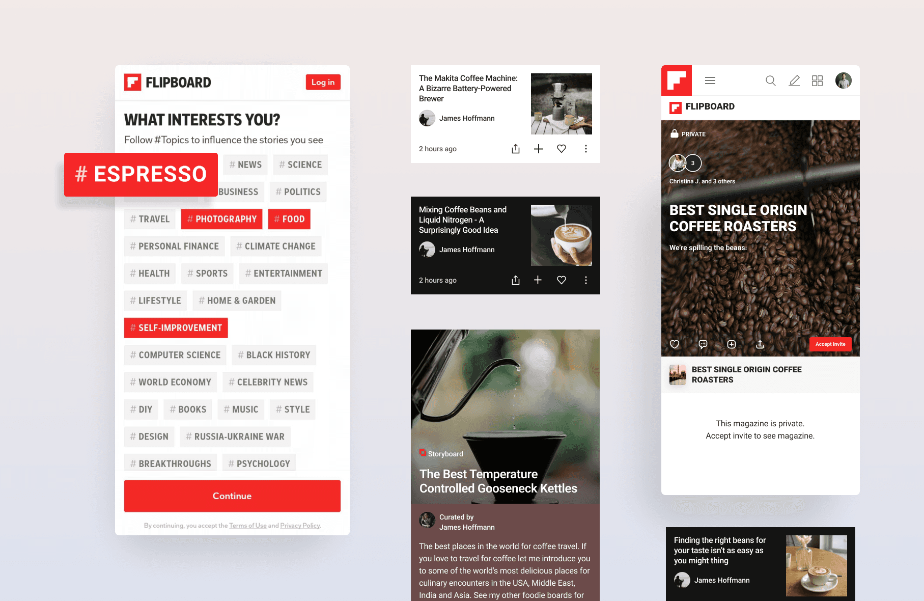
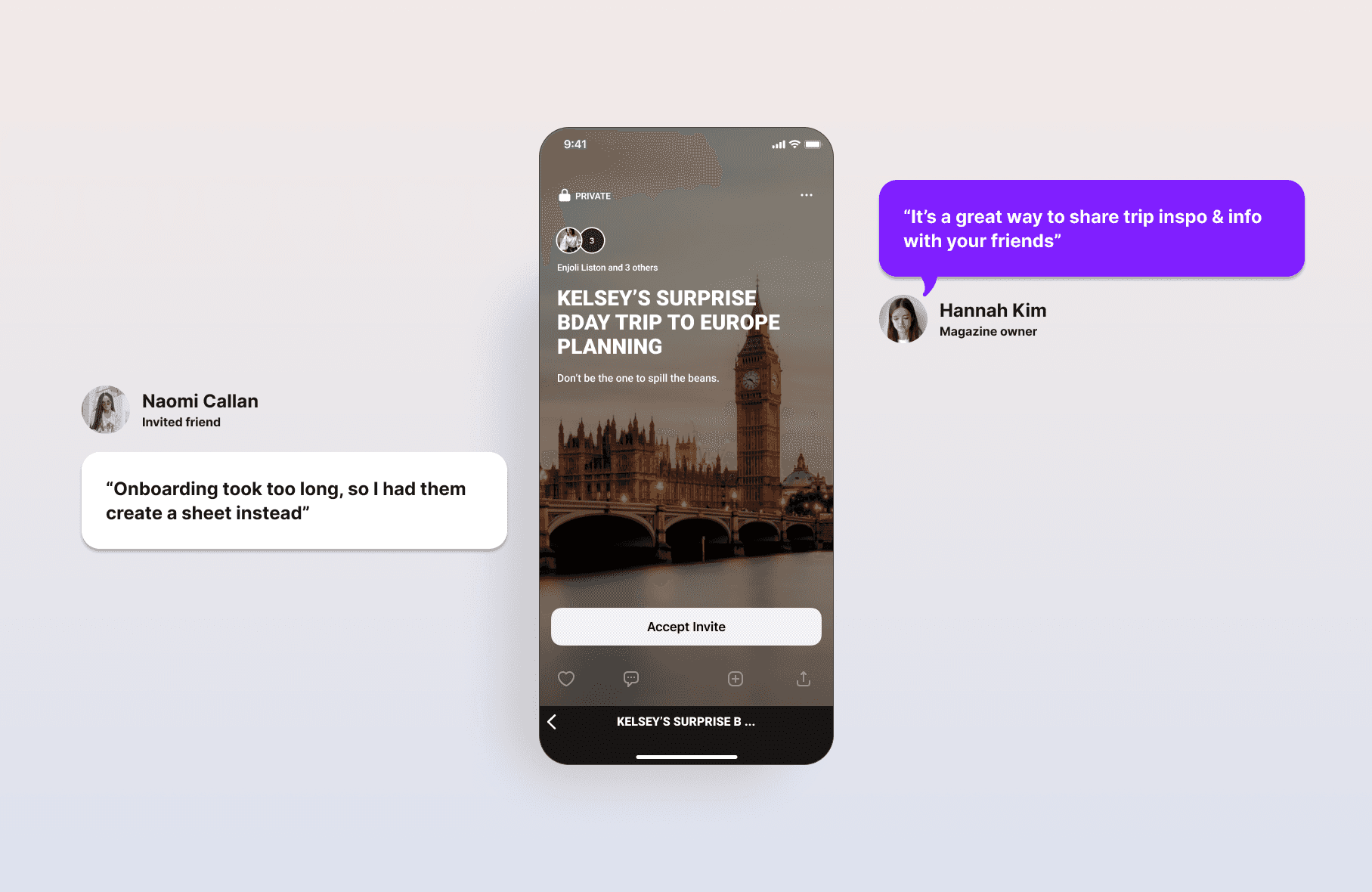
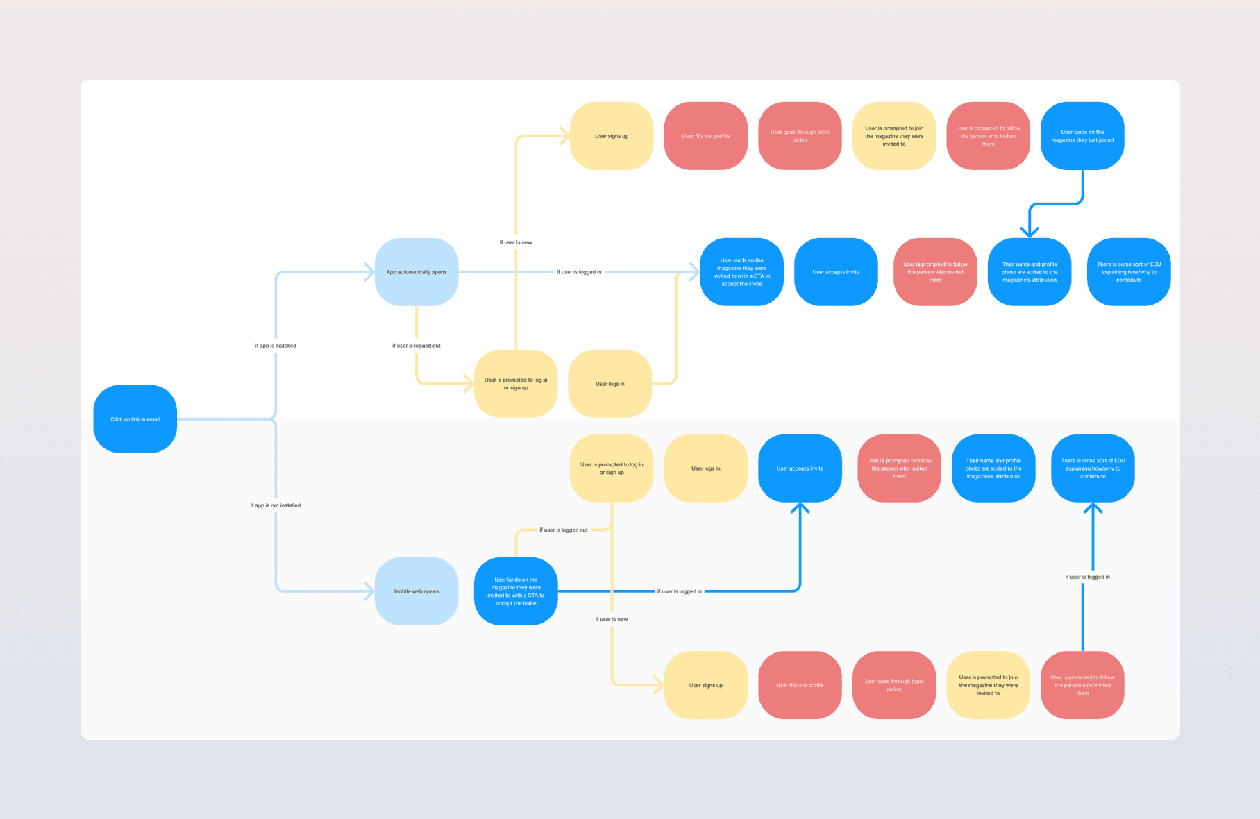
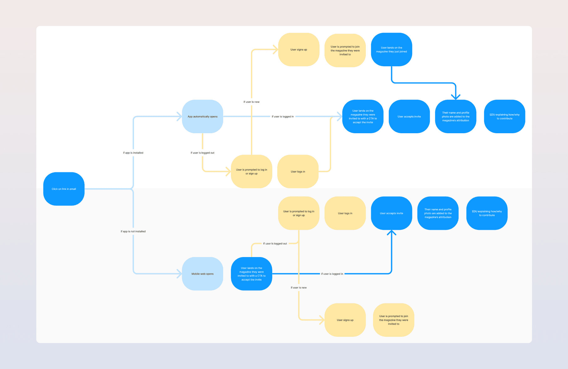
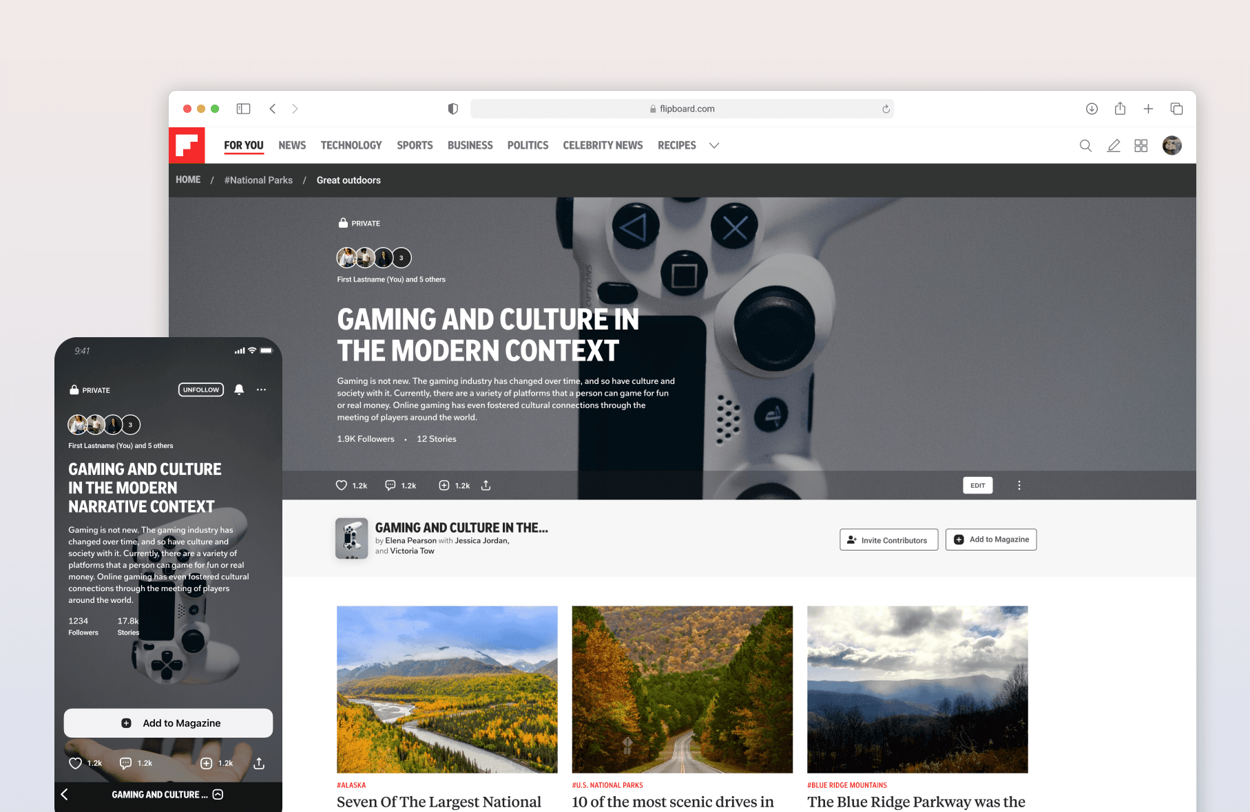
New users who are invited to collaborate on magazines rarely complete the accept-an-invite flow.
1 Product Designer
1 Product Manager
3 Engineers (iOS, Android, Web)
Since the topic picker does not affect the accept flow, I explored removing it. However, analytics show users who continue without choosing topics churn very quickly.
So, I suggested we remove the topic picker from the accept flow then show the topic picker to any topic-less user the first time they enter their For You feed.
This allows us to show users the topic picker directly where it will have impact, allowing users to see value in choosing topics.
For the full case study, please contact me.